CASE STUDY
Resolving Design Fragmentation
Now, as part of the IONOS Group and active in six European countries, Strato is a leading German hosting and HiDrive cloud-storage provider for businesses and individuals.

As a UX/UI designer for HiDrive, my role was to align HiDrive's design guidelines with STRATO's comprehensive brand standards and collaborate with four other UX designers to develop a cohesive design system.
PROBLEM
The HiDrive Cloud storage was made using three tools—starting with Sketch, then Adobe XD, and finally Figma. But working methods remained inconsistent, making it hard to follow naming conventions or locate specific files.

Most components needed additional drafts just to explain them to developers, and even the PO and PM had trouble sticking to the structure. Across the company, three different developer teams, each with different frameworks and different naming systems, are leading to confusion and duplicated effort.

There were often multiple versions of the same component, like buttons with unclear heights: 36px, 40px, or 44px? Without documentation or a shared system, every small task became a time-consuming challenge, frequently causing delays and follow-up tickets.
SOLUTION
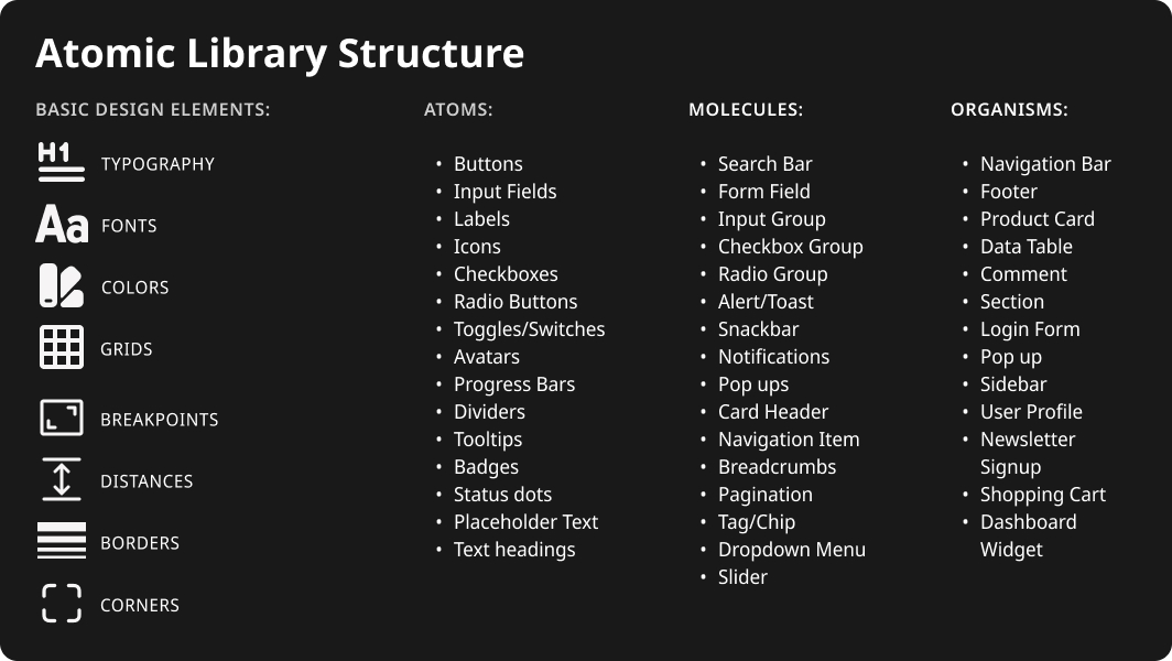
We created a scalable design system using atomic principles—standardizing typography, spacing, and colors. Built with Figma variables and variants, components became reusable across web and app platforms.

The color palette was reduced from 300 to 60 tones, and buttons were redesigned into 54 accessible variants for light and dark modes. This streamlined UI improved performance, ensured brand consistency, and made design-to-dev handoff more efficient.
IMPACT
By leveraging Figma variables and collaborating with three development teams, we achieved 50% faster developer handoffs, 75% faster design cycles, and 90% WCAG 2.1 AA compliance.
Methodology
During several months I used a Double Diamond innovation and design process, including User - Centered design and Design Thinking.
My Role: 

UX/UI Design
& UX research
Year: 
2023/24
Duration:
18+ months
UX Research methods:
- Competetive analysis
- User Interviews
- Usability Testing
Reading time of the whole working process cca 7 min
Phase 1: Discover
Where
the Friction
Lives?

Overview & Background

HiDrive’s UI and Strato’s web platforms had grown fast—but without a shared visual language. Components were scattered, styles inconsistent, and accessibility wasn’t keeping up. We needed a clearer, more scalable foundation.

I led UI improvements and contributed to developing a scalable design system for Strato’s web and app platforms as part of a team of 4 UX/UI designers and our Head of UX & Web Design.

My specific responsibility was improving the HiDrive cloud storage UI and aligning it with the main brand. This initiative addressed UI inconsistencies, accessibility gaps, and inefficiencies in design handoff.

Total Fragmentation

Designs were made in Sketch, Adobe XD, and Figma—depending on the team or the year. Ticket names weren’t aligned, and locating files often felt like a treasure hunt. It slowed down every release.

UI Inconsistencies

Across Strato platforms, countries, and mobile devices, we spotted small but recurring inconsistencies. These not only weakened the brand but also caused confusion between teams and led to duplicate work. Below is just a glimpse—navigation spacing and logo placement—but the issue was spreading across many components.

Cross -Team Gaps

Each of the three dev teams used its own tools and structure. Components built from the design side were duplicated, misunderstood, or rebuilt from scratch. It was a real challenge to know which version was the latest or the correct one.

Accessibility Gaps

Contrast issues, missing alt texts, and inconsistent spacing all led to a growing WCAG debt. With new EU accessibility regulations approaching, it became clear that we couldn’t wait any longer.
A few examples (notification & progress bar) are visible in the photo below with contrast failure.
Phase 2: Define
Creating a Shared Design Language

Goals & Priorities

We needed to reduce friction in design handoff, align with the refreshed brand, and meet the upcoming WCAG 2.1 AA standards. The goal was a shared system that could scale across all platforms—web, mobile, and desktop.

Audit & Inventory

We started with a detailed UI audit: fonts, colors, spacing, and all components were mapped across Strato’s portals and HiDrive. This helped us understand what we actually had—and how far we were from consistency.
In the image below, you can see examples of the two segments presented in Figma pages.

First, DS elements and second Components, where we used the traffic light system for easier orientation (red=nothing here; green=done; white=not available; yellow=in progress).

Problem Summary

Too many versions of the same thing—buttons, icons, even basic layout grids. Without documentation, every handoff raised new questions. Accessibility fixes were scattered, and development slowed down by guesswork.
Phase 3: DEVELOP
Building for Scalability and Inclusion

Workshops & Syncs

We held regular sessions with our UX lead and dev teams to align expectations and clear up naming issues. These workshops were key in building trust and making sure our component system would be used.

Atomic System

We built an atomic structure starting with colors, fonts, grids, and spacing. From there, we moved up to atoms like buttons and inputs, then molecules like snackbars and form fields, and finally larger organisms like nav bars.

Component Building

Once the base was solid, we started building out components directly in Figma. Each had defined states, sizes, and interactions—plus light and dark versions. The goal: reduce guesswork and speed up reuse across platforms.

Color & Contrast

I cleaned up the HiDrive color palette—from 300 shades down to 60. This reduced confusion and helped us hit contrast targets. Progress bars, toasts, and buttons were redesigned to pass WCAG checks.

Documentation

Since we worked at different times, it was challenging to track who did what. I suggested adding release notes as an activity log or history tracker. This way, we could follow who made which changes and when.

Documentation was built directly into the Figma files. Every color, spacing unit, and component had a reference page with a status (in progress / done). This helped us collaborate more smoothly and efficiently.
Phase 4: Deliver
Rolling Out and Making It Stick

Team Rollout

We introduced the design system in phases. First, aligning all teams on shared components. Then gradually rolling out improvements—colors, typography, spacing—across platforms. We had weekly syncs with devs and PMs to stay on track.

WCAG Compliance

Improving accessibility wasn’t optional. With new regulations arriving in summer 2025, we prioritized contrast, spacing, and alt text. By the end, we reached ~90% WCAG 2.1 AA compliance across major UI areas.

Results & Metrics

Although the design system is not fully complete, the project has already delivered significant results that we have noticed.

Most importantly, fewer misunderstandings and cleaner handoffs. Work just flowed better.

Learnings

This project emphasized the importance of systematic, time-sensitive approaches to building design systems and underscored the value of close collaboration between designers and developers.

If I were to do this project again, I would:

- Start documentation earlier.

- Involve developers with naming conventions.

- Make accessibility part of design, not a checklist.

- Keep promoting the benefits of the design system—people adopt what they understand.

Next Steps

Dark mode is still being integrated. Around 25% of components are in the final stage. We're also looking at deeper integration of IONOS variables for brand flexibility. It's not done—but it's scalable, and it’s working.