Overview
I led the redesign of HiDrive’s search functionality across desktop, mobile, and tablet platforms, collaborating with stakeholders, developers, and UX peers.
The project focused on balancing technical constraints (e.g., IONOS white-label dependencies) with user needs for intuitive search. Through iterative prototyping, usability testing, and stakeholder alignment, we delivered a streamlined interface that improved usability while maintaining familiarity.
Why users avoiding search?
To understand the problem, we needed to check the current state, examine our data, review our competition, identify any limitations, and explore new design trends and patterns.
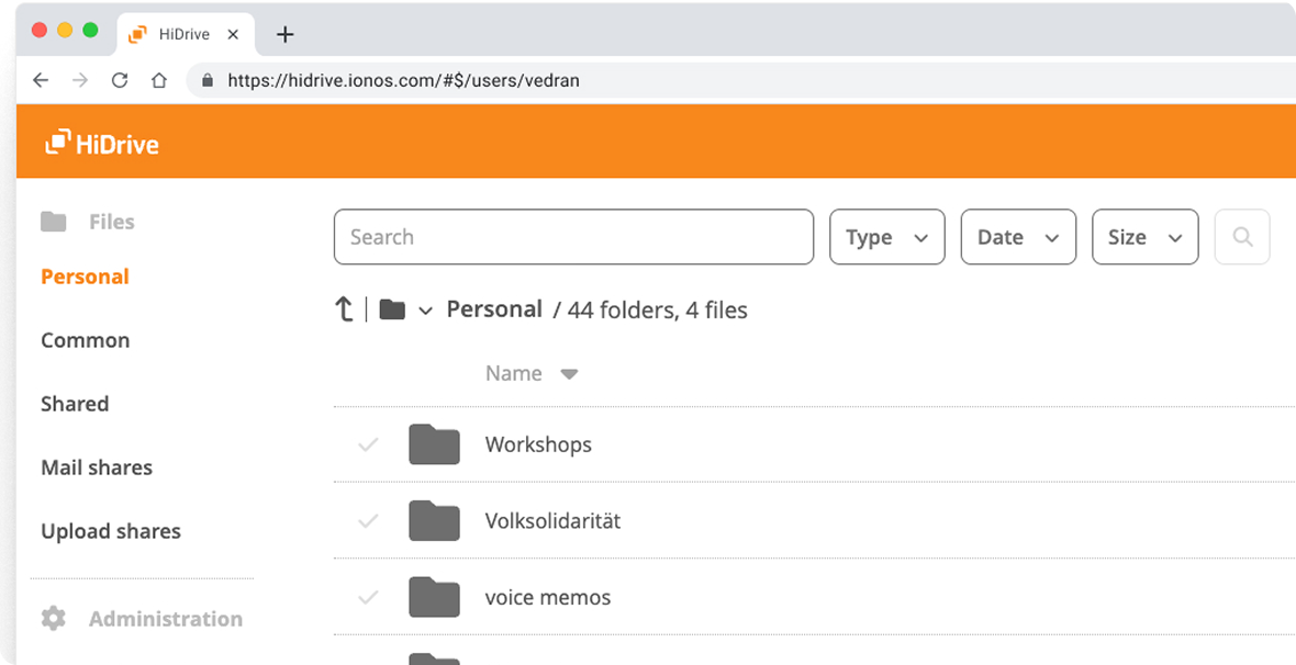
Current state
The navigation bar included a search by keywords, along with sorting options by name, type, size, and the last modified date.

Data
Statistics show that a very small number of users utilize the search option.
Over 75% of users are using the web frontend, and the number of users on devices is slowly rising.
Competition
Offered beside keywords & sorting a variety of advanced search options.
*Navigation bars from the competition with the dropdown menus.
What was discovered?
- Analytics audit. Only 4% of active users clicked the search bar; most resorted to manual folder navigation.
- Competitor analysis revealed gaps in HiDrive’s search compared to industry standards. Lack of advanced filtering options like: date, file type, and size.
- Inconsistent search patterns over Web and Native apps.
(iOS & Android). - Technical limitations are preventing modifications to the navigation bar due to existing dependencies, which were discovered later in the process.
Concept development
To develop a feasible solution, I created two distinct concepts.
01. Modern Ambition
Search with navigation bar and integrated filter chips.
(later discarded due to technical constraints).
02. Classic Pragmatism
A search with dropdown menus below the Navigation bar.
(chosen for feasibility and user familiarity).
Modern Ambition
Search Field Size Constraints
Limits exist on the search field’s width in the desktop navigation bar and on its height in the mobile view (where it can occupy almost one-third of the screen).
In the desktop version, the search field performs well until users add multiple filters, at which point the navigation bar quickly reaches its maximum width. Similarly, in horizontal (landscape) mode on mobile devices, the search field’s height can become excessive.
Classic Pragmatism
Functional & simple
After many temptations with the first version, the search feature was placed under the navigation bar.
This took up space in the “content area,” but the trade-off proved to be a better long-term option.
For users, it was simple to understand and faster for development. Chips were added for improved usability.

Prototyping
Based on four user flows,
I developed prototypes in Figma for usability testing purposes.
Since this is a prototype, and only a few selections are working, so when trying, please use the following selections:
Type: photos or video
Date: last 90 days
Size: > 500 MB
Click here to try prototypeUsability Testing Highlights
Over one working week, 5 participants completed 35–55 minute sessions using a detailed test plan, script, and scripted tasks. I managed scheduling (with backup slots for no-shows) on a rapid user-testing platform and conducted brief open-ended interviews.

This led us to the final phase of collecting and organizing the data from usability testing and interviews.
UT Analysis & Implementation
Over 1½ weeks, I transcribed and affinity-mapped feedback, uncovering key UI, search, functionality, and pricing/marketing insights. I then presented data-driven recommendations—with responsive breakpoints and dark-mode Figma components—to PMs, POs, developers, marketing, sales, QA, and support teams, securing broad buy-in (with some stakeholders reviewing session recordings) and earning praise for the depth of research.


Results & Impact
After 2+ months, there were over 5 hours of video recordings of user tests, hundreds of screens for desktop, mobile, and tablets, and 2-3 versions of prototypes for each mobile and desktop.
Below you can see the states before and after.
BEFORE
Only keyword search posible

AFTER
Advanced filtering options
The finished user flow is shown in action below for HiDrive.

For IONOS, you can also see a white label version displayed below.

IMPACT
After introducing advanced search options, user interaction with the search bar rose by 72.6% over time.

Reflection & learnings
- Involve developers earlier to address technical constraints proactively.
- User flows before prototyping
- Test low-fidelity wireframes before high-fidelity prototypes to identify issues sooner.
- Users from 22 to 28 years gave more feedback
- Transcription with fewer details will save time
- More attention to the analytics (before & after)
- Allow 3+ months for relevant measurement data
- Position the search field lower in the thumb zone on mobile devices to enhance accessibility and usability.
Future Improvements
- Expand advanced filtering (metadata, custom date ranges).
- Search for iOS & Android devices, as well as Mac and Windows.
- Assess the feasibility of searching within files.
Conclusion
We gave HiDrive’s search a real tune-up—keeping it simple, doable, and in line with what users actually need. The streamlined design makes finding files a breeze and sets us up nicely for future upgrades.
By leaning on usability feedback and close teamwork, we ended up with a scalable, user-focused solution and a clear roadmap for what’s next.


